Michelangelo Lovelace
(Cleveland, Ohio, 1960 - 2021, Cleveland, Ohio)
Untitled
2001
Acrylic on Canvas
19 5/8 x 19 3/4 x 2 in. (49.8 x 50.3 x 5.1 cm)
Collection of the Akron Art Museum
Gift of Colleen Sweeney and Herbert Ascherman, Jr.
2024.17
More Information
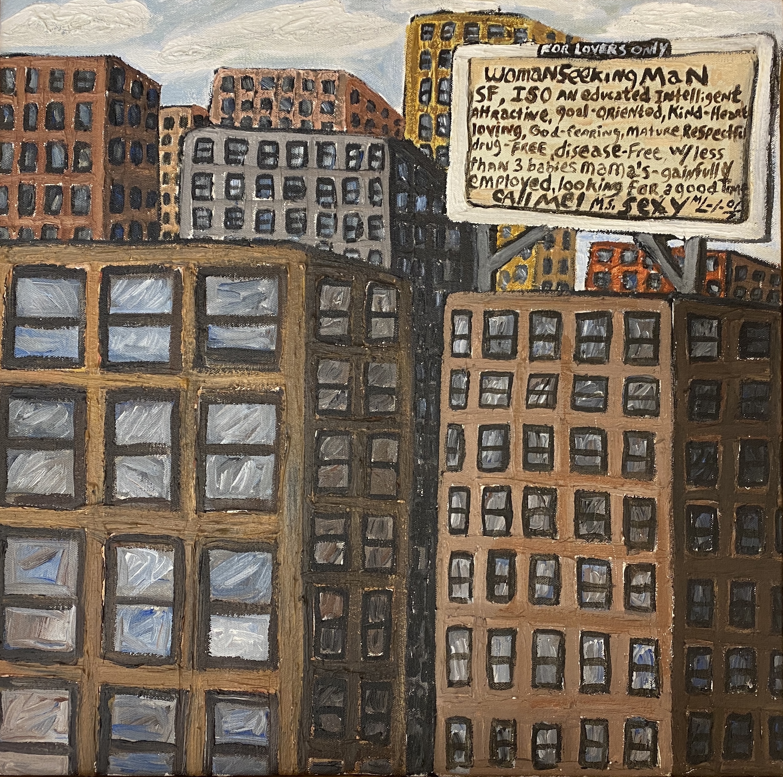
This relatively small, untitled painting is something of an outlier within Michelangelo Lovelace’s representations of city life. For this canvas, he eschewed many of the features found in his other urban scenes—downward views highlighting grids of streets, busy crowds of pedestrians and cars in traffic, bricks that make connections to public housing projects and the inner-city environment more broadly, etc. The picture does prominently feature a billboard, reflecting the artist’s longstanding inclusion of text in his works. As he said, “I always put text in my work because there’s text everywhere. Because I’m looking at my environment, I also have to look at the signs and the words that are being used in my environment.”7 Nevertheless, the painting’s sole piece of signage remains somewhat atypical in its isolation, where in other works Lovelace was more likely to create a cacophony of written message talking across one another from storefronts to billboards and street signs. At the same time, the degree of visual interest with which the artist imbued this painting is notable. Across his career, Lovelace became a skilled and intentional painter of surfaces that might otherwise have been rendered in a flat fashion—most of all, his later bricks often feature not just a standard red-orange hue, but also blues, yellows, bold reds, and a multitude of brush strokes. Here that energetic brushwork brings the walls and windows of skyscrapers to life with a sense of movement mixed into their monumental solidity. And while Lovelace often emphasized linear perspective and the use of a vanishing point to suggest depth in his pictures, here irregular overlapping of buildings suggests a different kind of urban crowding, almost as if the edifices are jostling for visibility. For the most part they become taller and taller as one looks back into the distance, with each stretching out above its nearer neighbors. Finally, utilizing a range of color that is narrower and more subdued than in many of his paintings, Lovelace effectively balanced the differentiation of these individual buildings against a sense that together they constitute one unified mass at the heart of a downtown area. Turning to the billboard’s text in itself, Lovelace humorously transposes the format of a “personal ad” from the relatively subdued and obscure depths of a newspaper’s classified section to a prominent, largescale display that shouts from a rooftop. The nature of the writing is confirmed by the inclusion of a headline (“Woman Seeking Man”) and the use of abbreviations typical in classified advertisements (“SF” for “Single Female” and “ISO” for “In Search Of”). It is up to individual viewers to decide if the use of a billboard for this purpose might be an individual act of desperation, or if it represents a more collective (and perhaps collectively frustrating) search for a suitable partner. One might also decide whether the writer of the advertisement is overly picky in their substantial list of qualifications, or if the litany rightly reflects the numerous pitfalls that one might encounter while dating. Looming large over a scene that lacks an immediately visible human population, the billboard’s message may seem both lonely and exuberantly confident, ending as it does with “Call me!” and the signoff “Ms. Sexy.”

