

Totally Rad: Bold Color in the 1980s
By Jeff Katzin, Curatorial Fellow
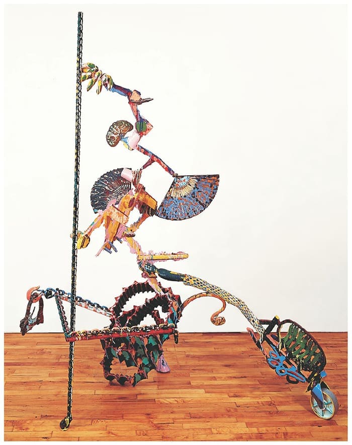
This exhibition about the vibrant hues of the 1980s started with a simple question: “What’s that?” This is what I asked Steph Petcavage (the Museum’s collections manager) and Seema Rao (our deputy director) as the three of us walked past a spindly, multicolored, and unmistakably ‘80s-looking sculpture in our art storage area. I’d actually been meaning to ask about the piece ever since I’d noticed it a few weeks earlier—even in a big room that houses most of the Akron Art Museum’s collection, this bright and shiny work of art stood out. They told me that it was made by the artist Nancy Graves, and that it was waiting to go back to a private collector after an earlier plan to display it in our galleries fell through. My next question: “Do you think the owner would mind if we kept it a little longer and included it in a new project?”
[Nancy Graves image]
I soon found myself searching through the Museum’s collection to build a show out of only the most vivid, the most energetic, and the most rad works from the 1980s. As I looked, I also researched the phenomenon of ‘80s color and was surprised at what I found. Though the decade is very well known for its distinctly bold colors, there is no grand unified theory or single source for why artists embraced flashy colors at this particular time. Affordable, brightly-hued acrylic paints had been widely used since the 1960s, so it is not as if artistic access to color suddenly expanded. Instead, most historians point to a broad mix of factors from television to music, music videos, video games, graffiti, fashion, the materialism brought on by an economic boom, and more. Ultimately, color made its way into all sorts of places in the ‘80s, and so different artists each found it in a different way.
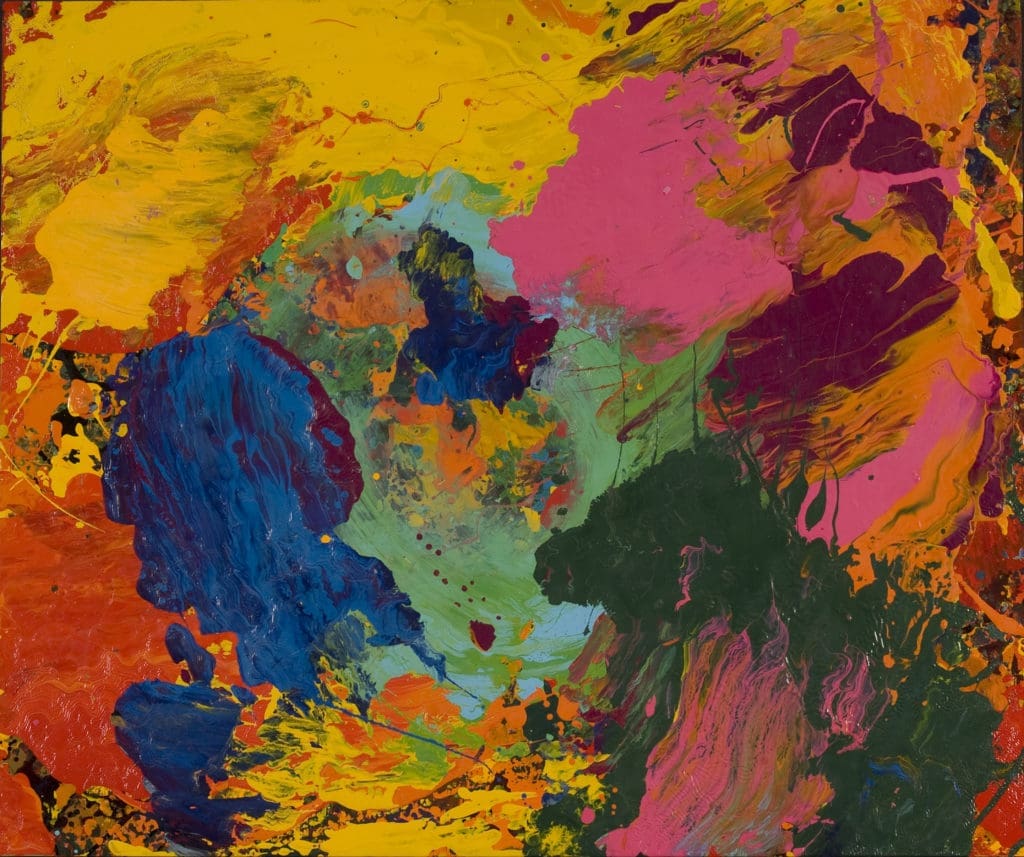
To start with an artist who enjoys color simply for the creative freedom that it affords, we need look no further than Charles Clough. In 1984, he attached a thick pad to the end of a pole and started using this tool to make his paintings, calling it the “Big Finger.” Eventually, he crafted several fingers: larger ones for large pictures and smaller ones too—but all were “Big” because they were bigger than the artist’s own finger. Clough found that these simple devices allowed him to loosen control over his work and discover spontaneous, exciting possibilities as he spread enamel paint into constellations of color. I enjoy Clough’s work because I find that he’s quite right about all of this. If I sit down and try to draw a nice picture, I’ll always end up falling back on my usual styles of line, proportion, and composition. But, if I use some strange and uncontrollable process, the materials can take on a new style all on their own. This can work in an abstract image like Muniment, or even in a realistic picture. Fittingly, Clough used odd, unfamiliar words like Muniment as titles to promote a sense of playful fantasy in his exuberant pictures.
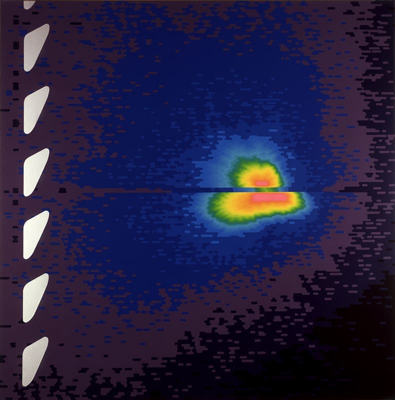
Jack Goldstein approached color from almost the opposite perspective with a much more studious approach. He was interested in what makes an image appear convincing and true; in what provides the look of documentary evidence rather than personal expression. He investigated these qualities by bringing them into painting from outside sources, often starting with imagery that he found in science magazines or history textbooks. Though it conveys no particular information, this painting looks scientific and objective because it has all the features of a digital image produced by a weather radar or an infrared camera—pixelated details, random noise, and rings of increasingly intense colors. When I look at the painting, my instincts tell me that it represents some kind of significant data… but maybe it doesn’t. Maybe Goldstein is just playing a game with me, giving me a chance to reflect on why some images seem believable while others do not.
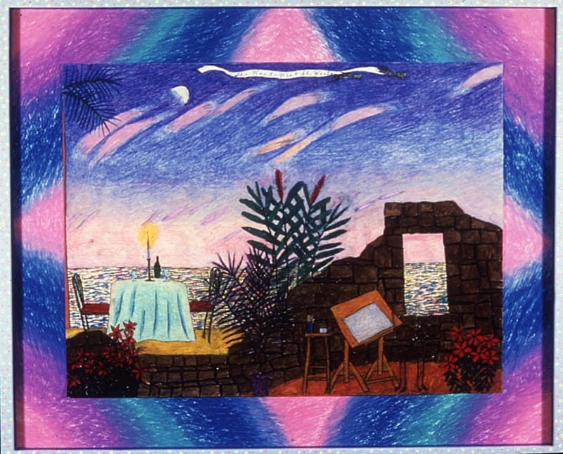
Hollis Sigler also used bright colors to help her art seem truthful. She started her career making extremely detailed photorealistic paintings , so she had all the skills necessary to produce highly polished pictures. However, she soon realized that she wanted to share deeply personal experiences. She started using brightly-colored crayons and oil pastels, shifting into an intentionally childlike style to make images drawn from her own life seem as direct and honest as possible. In She Wants What She Wants, Sigler depicts places and objects that hold special meaning for her: the beach, a candlelit table for two, an art studio. Her title implies that these are things she is unwilling to let go of, that bring her satisfaction, that she must have. However, the drawing’s dreamy appearance—heightened by hazy pinks and blues—suggests that she may not have all of them just yet. The doubled use of the word “She” also emphasizes that these desires come from a woman’s point of view—an important point for Sigler, an outspoken feminist. She Wants What She Wants shows that works of art can be colorful and rad, but also tender and sincere at the same time.
There’s no substitute for seeing all of these loud and lively works of art in person, but if you would like to feel some Totally Rad vibes from home, check out this playlist that I put together. It contains some of the music that I listened to while selecting works and doing research for this exhibition; songs that helped me feel more connected to the colorful side of the ‘80s.
And if you missed it, check out our earlier exhibition tour covering another aspect of the ‘80s through Totally Radical: Art and Politics in the 1980s.
Totally Rad: Bold Color in the 1980s is organized by the Akron Art Museum and supported by funding from the John S. and James L. Knight Foundation, the Ohio Arts Council, the John P. Murphy Foundation, Katie and Mark Smucker, and the Kenneth L. Calhoun Charitable Trust, KeyBank, Trustee.